Thursday, December 15, 2016

MoMA Trip

     Visiting the MoMA is always an amazing and eye-opening experience. The pieces are exquisite and inspiring. I believe that appreciating modern art is important because, like humanity, it is a phase of evolution. A new step in the emotional and psychological human experience that deserves recognition just as much as any meticulous and elegant piece from the renaissance or Greek period.


Abstract Expressionism 1940's

     I am especially interested in abstract expressionism. I think the emotion and underlying meaning is a beautiful way to look into the heart and mind of the artist. One of the most popular expressionist artists, Jackson Pollock, is a pioneer of expressionism. The work below, Number 1A, was painted in 1948 and is seen as one of his greatest expressionist pieces. Pollocks substantial pieces need to be seen in person. Number 1A is huge, measuring in at 8'10"x 17'5".
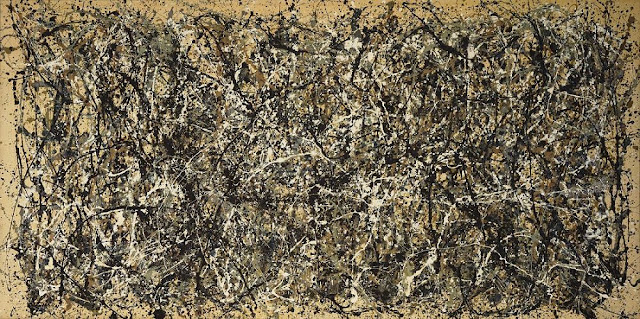
      Using methods like drip painting, a technique where paint is dripped or poured onto a canvas evokes strong feeling of disorder and chaos. His work looks unplanned and random, but his work was meticulously planned and layered accordingly. These massive pieces when viewed more closely feel electric and alive. This creates a mental video of the creation of the piece.
Pollock carefully "dripping" over canvas
Pollock's first layer was a series of handprints
that set the body of the piece
His use of his body, brushes, and the tubes of paint themselves is remarkable and pertinent to the reception of the piece. Here we can see that a closer look shows us that Pollock was not only dripping but that he used his body as a tool for mixing. He has left an enduring piece of himself on his art. The viewer can imagine Pollock pacing around his canvas contemplating his next step, they can imagine him getting down onto his hands and knees and becoming an element in his art.

Pop Art 1950's

     Moving on to a very influential period of art, pop art. Appearing in the mid to late 50's, pop art challenged modern day consumerism and mocked pop culture, advertising, commercials, and social icons. During this time America was experiencing a cultural shift, advances in technology and the growing relevance of mainstream media, but also reeling against the war in Vietnam. Pop artists parodied popular culture as a form of "sticking it to the man" and spreading dislike for the materialistic culture of the Western world. In my opinion, pop art acted as a catalyst for the punk movement in the late 1970's and 1980's.
     Like Dada, pop art uses many mediums and found objects used in collages and sculptures. Heavy use of primary colors made pieces visually captivating and the use of everyday mundane objects represented as art was thought provoking. Pop art was also seen as controversial because it changed our concept of art. Artists were no longer only creating original concepts or imagery, but copying familiar symbols.
Campbell's Soup Cans, each canvas 20x16; 1962

     One of the most renown artists, who many see as the leader of American pop art, Andy Warhol was a master of challenging our vision of originality. Campbell's Soup Cans, is proof of this from the get go. It is composed of 32 of Campbell's soup varieties, to be arranged in no particular order. The cans are hand painted and stamped, a method he would largely abandon for photo-silkscreen processing. Warhol believed that everyone should be able to appreciate art, and what better way to reach the masses then by making his art familiar.


Friday, December 2, 2016

Performance and Video Art

Elizabeth Charlotte "Pipilotti" Rist, born in 1962 to Swiss doctor (father) and a teacher (mother)
She was given the nick name Pipilotti when she was a child, referring to children's novel Pippi Longstocking.
Studied commercial art, illustration and photography at the University of Applied Arts Vienna, then she studied video production at the School of Design in Switzerland.
From 1988-1994 she played in a woman's rock band and performance group called Les Reines Porchaines.

Themes:
Gender, sexuality, feminism
Multiple projector video installations with sound, lighting, and often staging with furniture.

Works:
She is known for her installations, mostly in film/projector format. Her interesting content and method of projection has caused an evolution in video art.
Part of art to Rist is to make art that can be appreciated by anyone, and can be enjoyable, stating, "the most important job of the artist: try not to just reach the converted"
Strange, captivating, but not intimidating

Influenced by:
Contemporary media and advertising and other video artists Joan Jonas, Vito Acconci, and Nam June Paik

In today's culture:
The music video for "Hold Up" but Beyonce is strikingly similar to Rist's "Ever Is Over All"
Her exhibitions remain very popular.

Sources:
Pipilotti Rist, Provoking With Delight

Thursday, December 1, 2016

Art and Social Change

    Art can work in very powerful ways. It can evoke emotional responses to things we may not have thought about often. Creating art can change the way someone thinks and redirect parts of their life. Vik Muniz, modern artist, takes us on an adventure to Jardim Gramacho, a large landfill outside of Rio De Janeiro. Here he introduces us to a few of the workers in the landfill and their stories.
    Tiao, the catadores leader, had been working in the landfill since he was 11 years old. A prolific reader, Tiao would find books scattered across the fill, indulging himself with new information. He reveals that he read The Prince by Machiavelli, which gave him a lot of ideas about leadership and the state of the world and it's governments.
    The work the group made was sold for a total of $300,000. After this, Tiao was able to continue working on his dream of creating an association to assist the people who work in the landfill. Today his association works with the Brazilian government to send workers to recycling plants opening up around the city.
    What impacted me the most about this documentary is the mere amount vast amount of waste we have accumulated. We waste so much. The sheer amount of waste we discard to be taken care of by someone else is disgusting. As Walter mentioned, so many people will not recycle one thing, but that one thing over a long period of time adds up to an insurmountable amount of waste.
    Not only is it harmful to our planet, but the people who are left responsible with handling our garbage are at a great risk. Thousands of people waft through toxic waste and sharp objects, they are at risk of being crushed by the giant trucks and bulldozers, every day. Not only is it physically taxing, but it also takes a toll socially and emotionally. Not many of the workers are proud to admit that they work in a landfill. Often, they were average class people who experienced hardships and were forced to make ends meet in any way they could. Others that were born there still have dreams of a bigger future.

Sunday, October 30, 2016

Modern Movements; Art After 1945; Kiki Smith


     Born to a German Catholic family raised in New Jersey, Kiki Smith uses her history of formalist art, learned from her father, to create beautiful figurative sculptures, drawings, and pieces with different and mixed mediums. Her themes are usually focused around sexuality, birth, and regeneration.
Harbor, 2015 for Woven Tales
Her upbringing in the Catholic church encouraged a recurring theme and fascination with the human form. This coupled with her brief time studying to become an emergency technician further expanded her knowledge of human anatomy. After the death of her sister from AIDS in 1980, she became enamored with death and mortality. This death probed her to make many pieces featuring bodily fluids including blood (relating to the AIDS epidemic), and urine, menstrual blood, and feces (relating to women's rights).
     The picture on the right is a tapestry done by Smith in 2015 for her 2016 exhibition, Woven Tales. The tapestries are 10 feet tall and translate into a story. The pieces are made by first creating large collages from paper drawings, cutouts, photolithographs, and other textured elements. The collages are then photographed, at real size and sent to a third party studio, printed again, and returned to Smith where she continues to layer media. Then, usually after months, when the piece is finished, it is then scanned and translated into a digital weave, and translated into a tapestry by an electronic loom. So cool, I didn't even know such a thing existed!

Wednesday, October 12, 2016

Impressionism and Post Impressionism late 1800's-1900

Water Lilies, Claude Monet, Impressionism
      Impressionism, coined by a critic in the 19th century, was introduced by a group of artists based out of Paris. This style was used to capture an image as someone would see if they had just glimpsed at the scene. The characteristics include visible brush strokes and bright colors, usually depicting movement and the passing of time with light. The bold and unblended strokes produce a feeling of vibration.
     Artists were now bringing their easel outside. The artists believed that they could capture moods and lighting correctly by "en plein air", or, by painting in open air. Most impressionism paintings are of landscapes and common human subjects. Many artists used candid poses and scenes changing the way many viewed art. This painting to the left, part of a series of paintings, Water Lilies by Claude Monet, uses very large brush strokes and very little natural detail of the subject matter. These paintings, which are enormous in size this one 78"x79", and one mural is measured at 78"x502", are a long shot from what we looked at during the Renaissance and Baroque period. Interestingly, Monet was said to have been suffering from cataracts during the creation of this series. The blurriness of the painting could have very well been all of the detail Monet was capable of copying at the time.
Still Life With Profile, Paul Gauguin, Post-Impressionism
     Post-impressionism, impressionism evolved, uses different techniques and rejects the usual limitations in impressionism. Instead, there was a focus on geometric shapes, unnatural colors, and distortion to create an emotional response. During this period, pointillism, and other painting methods that reduced subjects down to simple shapes and colors was popular. The painting on the right, Still Life With Profile, by Paul Gauguin, uses pure colors, red and green with very little shading. You can also see the strong line of the mangoes. Heavy brush strokes can be seen on the wall behind the set and on the face. The table cloth has very minimal detail to capture the folds and shadows.
SaveSaveSaveSave

Wednesday, October 5, 2016

Visiting the MET

This week, on September 30th (my birthday, yay!) our class visited the Metropolitan Museum. This is my third visit, but I feel like it's the first time every time. We were asked to focus on Renaissance and Baroque works and sketch one from each period.

For the Baroque painting I chose "The Feast of Achelous" circa 1615 by Peter Paul Rubens and Jan Brueghel. The two collaborated for a series of mythological paintings. This piece was most likely commissioned for an elaborate collector.

This Baroque piece is identifiable due to the action and the asymmetry of the painting.


For the Renaissance piece I selected "Virgin and Child" by Jan Provost. Painted between 1495-1500, this painting is an excellent example of Renaissance work. Channeling religion, we can see the virgin Mary, Christ, and five angels above them presenting a crown. The nearly perfect symmetry and religious connotations are essential to Renaissance works. 

Wednesday, September 28, 2016

Art Principles

Artists use a wide variety of techniques to give their pieces meaning. These principles are essential to creating meaningful and beautiful pieces of art. Not all artists use each and every principle, it's what makes analyzing art so interesting. Not all principles are applied at once making each composition unique.


Unity is used to combine all of the elements in a piece to create balance and harmony. Repetition, continuation, and pattern are just some of the methods used to create unity. This painting by Swedish artist, Nick Alm is a great example of unity. The subjects are visually similar. The colors of their clothes are consistent as a pattern, black, white, black.

Asymmetrical balance is a crucial part of art. Seeing as how all works cannot be perfectly symmetrical, balance is incredibly important. Balancing a painting can define the subject matter and set the mood for the piece. Famous piece, Starry Night by Vincent Van Gogh, is a great example of asymmetrical balance. Although we see a heavy prominent object on the left, the color and depth of the right of the painting creates a sense of balance. In other words, the painting does not feel off center.


Scale is used to create meaning. Using a human scale is especially relatable, as we can compare ourselves to the mass of an object. In the image on the left, we see the enormous scale of a hand. Although we are not physically seeing the size of the hand, we understand that a hand could not possibly be that large. This gives us a sense of the scale of the painting.